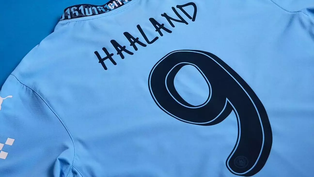
Manchester City’s decision to collaborate with musician Noel Gallagher for their custom font for the 2024-25 season was certainly unexpected. Gallagher, known for his time with Oasis, is a lifelong City fan, adding a personal touch to the design. The font is based on Gallagher’s handwriting, giving it a unique and personalized feel. However, the font itself has drawn comparisons to the infamous Comic Sans, raising questions about its overall aesthetic appeal.
The new font will be used to display player names and numbers on the City kits for the upcoming season. The design process involved Gallagher hand-writing the names and squad numbers of each player, which were then transformed into a bespoke font. While the font is undeniably distinctive, with a nod to Gallagher’s personal touch, its resemblance to Comic Sans may divide opinions among fans and critics alike.
It is important to note that the hand-drawn typeface will only be visible on the City kits during Champions League and domestic cup fixtures. Premier League rules stipulate that clubs must use preapproved style and color combinations for kit lettering and numbering. This limitation means that fans will only get to see the custom font on special occasions, which may disappoint those who were looking forward to its debut in all competitions.
Many clubs, including Real Madrid and national teams like Norway, have introduced custom fonts for their kits in recent years. Real Madrid unveiled an Arabesque lettering style for their 2024-25 home kit, adding a touch of elegance to their design. However, the effectiveness of these custom fonts varies, with Norway’s font drawing criticism for being difficult to read from a distance. While unique fonts can add a creative flair to kit designs, readability should not be sacrificed for the sake of aesthetics.
Manchester City’s collaboration with Noel Gallagher for their custom font is a bold move that showcases the club’s commitment to creativity and innovation. While the font may have its detractors due to its resemblance to Comic Sans, it undoubtedly adds a personal touch to the players’ kits. As the new season approaches, fans will be eager to see the font in action during Champions League and domestic cup fixtures. Ultimately, the success of the collaboration will depend on how well the font is received by supporters and its perceived impact on the overall aesthetic of the City kits.
Leave a Reply