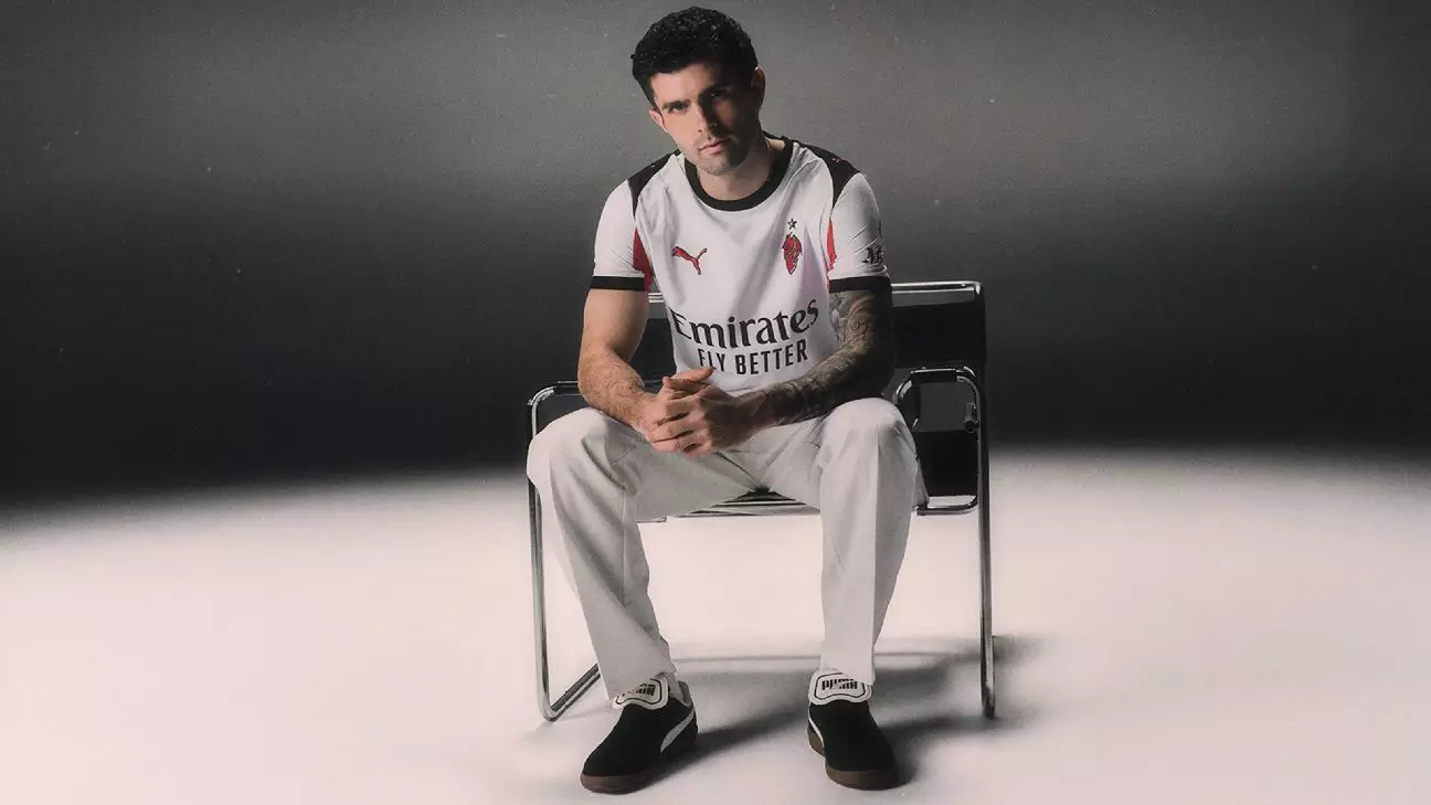
AC Milan’s latest away kit boldly merges tradition and modernity, embodying the club’s storied history with a design that’s both nostalgic and daring. At the heart of this jersey lies the mythical “Diavoletto,” a little devil mascot that has symbolized the Rossoneri for over a century. This emblematic figure isn’t just a design choice; it’s a deliberate homage to Milan’s fiery spirit and resilient legacy. By reintegrating the vintage stylized logo — first seen during a tumultuous period in the club’s past — the kit aims to remind fans of the club’s tumult, triumphs, and enduring passion.
The decision to revive the Diavoletto logo from the early 1980s evokes a complex emotional response. On one hand, it celebrates resilience, reconnecting fans with a period of intense dedication and adversity when Milan faced relegation amid scandal. On the other, it raises questions about the optics of glorifying a contentious chapter that many would prefer to forget. Yet, it’s an authentic choice that underscores the club’s acknowledgment of its full history, not just its glories on the pitch but also its darker moments that are integral to its identity.
Design Simplicity Meets Historical Significance
The jersey itself is a minimalist canvas—an all-white foundation that keeps the focus on subtle but meaningful accents. Sparse blocks of red and black create a visual contrast, echoing Milan’s iconic colors while maintaining an understated aesthetic. This restrained approach, in contrast to highly intricate modern designs, signals a confident embrace of simplicity that’s rooted in centuries of tradition. It challenges the assumption that contemporary kits need to be loud or elaborate; instead, it suggests that true identity is best expressed through subtle nods to history.
However, not all aspects of the design are universally praised. The template’s resemblance to early 2000s training tops has sparked mixed reactions among fans and critics alike. Some view it as a nostalgic callback, while others see it as a step back from the sleek, polished uniforms of recent seasons—particularly when compared to last year’s elegant, polo-collared away shirt. The latter was a testament to Milan’s aesthetic sophistication, and any deviation might be perceived as a downgrade in style.
Star Power and Cultural Significance
Modeling the new kit is Christian Pulisic, whose presence lends a contemporary coolness that bridges Milan’s rich past with its ambitious future. His portrayal in a confident “Blue Steel” stance sends a message: Milan isn’t just resting on its laurels; it’s actively reinventing itself while honoring its roots. This pairing of modern star and nostalgic design underscores the club’s desire to stay relevant, competitive, and emotionally connected with its global fanbase.
In essence, AC Milan’s new away kit isn’t merely a piece of sportswear. It’s a statement—a mixture of historical homage, cultural storytelling, and strategic branding. As fans and critics debate the choice of design, one thing is clear: Milan continues to walk the fine line between honoring tradition and pushing the boundaries of contemporary football apparel, symbolizing a club unafraid to look both backwards and forwards.

Leave a Reply